Item & Subitem Form
Create powerful, customizable forms that map directly to your Monday.com board columns — with password protection, conditional logic, subitem collection, and full visual styling controls.
Installation
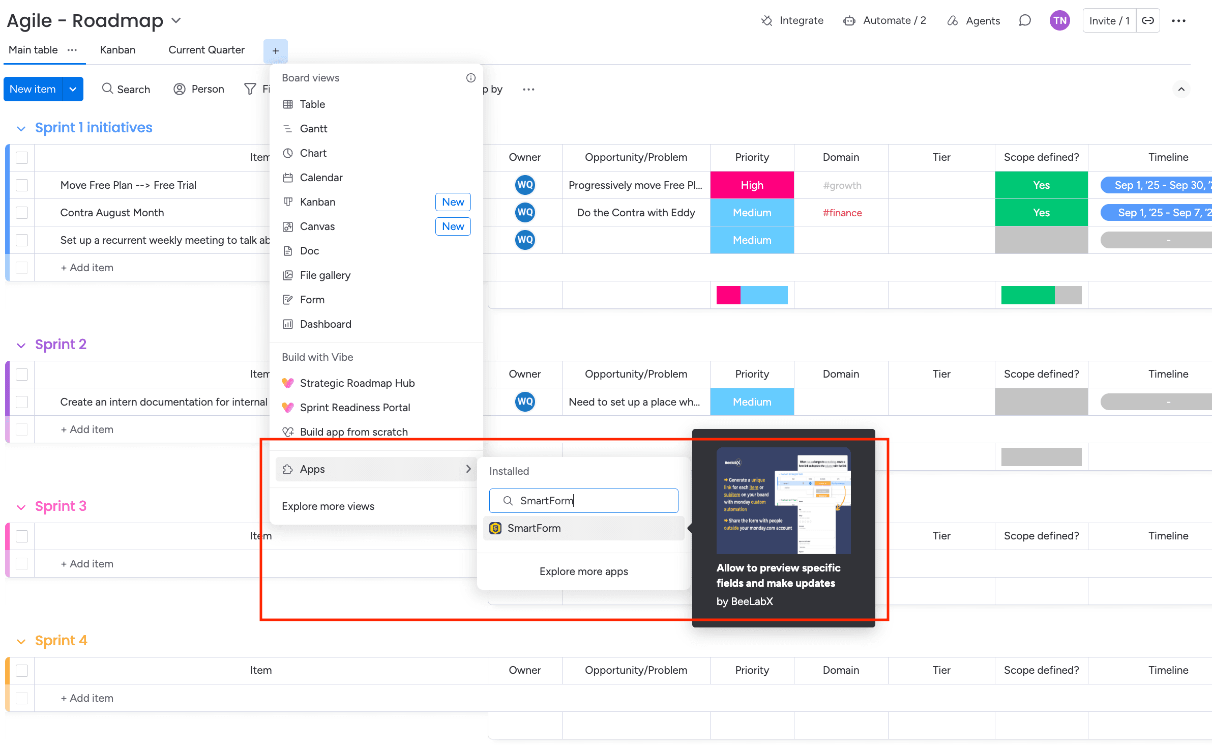
Find SmartForm in Board Views
Open your Monday.com board and click Views in the top navigation. Search for SmartForm and add it as a Board View.
Access Your Settings View
Once installed, SmartForm automatically creates a Board View called “SmartForm” — your central hub for creating and managing all form types.
Creating a Form
In the SmartForm board view, navigate to the Form Management table and find the Quick Create section. Hover over a form type to read its description, then click the icon to create one.
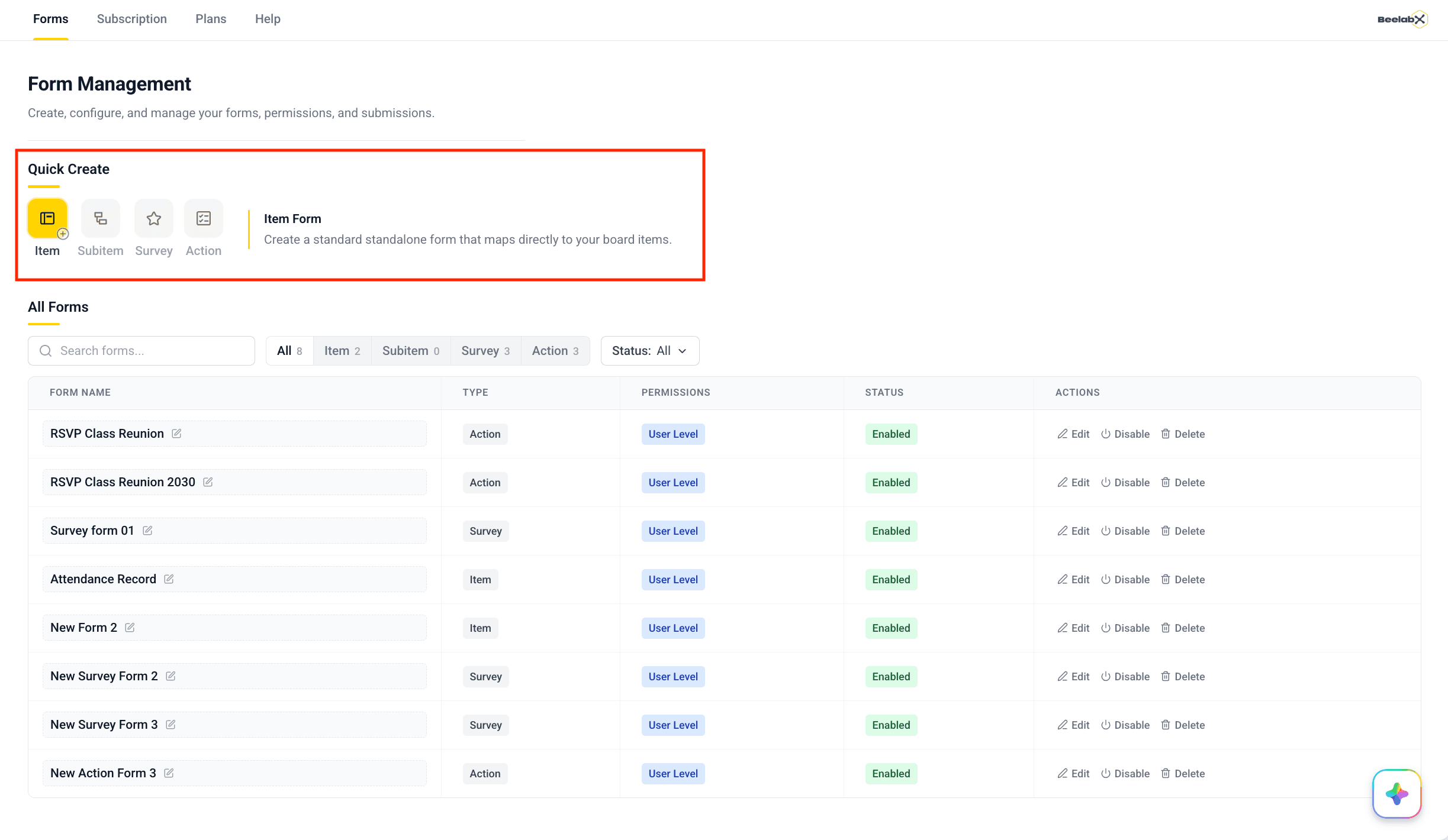
Form Types
| Type | Source Columns | Use Cases |
|---|---|---|
| Item Form | Main item columns | Customer intake, project requests, application submissions |
| Subitem Form | Subitem columns | Task details, multi-step workflows, nested data collection |
| Action Form | Status / Radio columns | Actionable emails with clickable buttons — no Monday account needed |
| Survey Form | Number, Rating, Text columns | NPS and star-rating feedback collected via email |
General Settings
Configure your form’s identity and access controls.
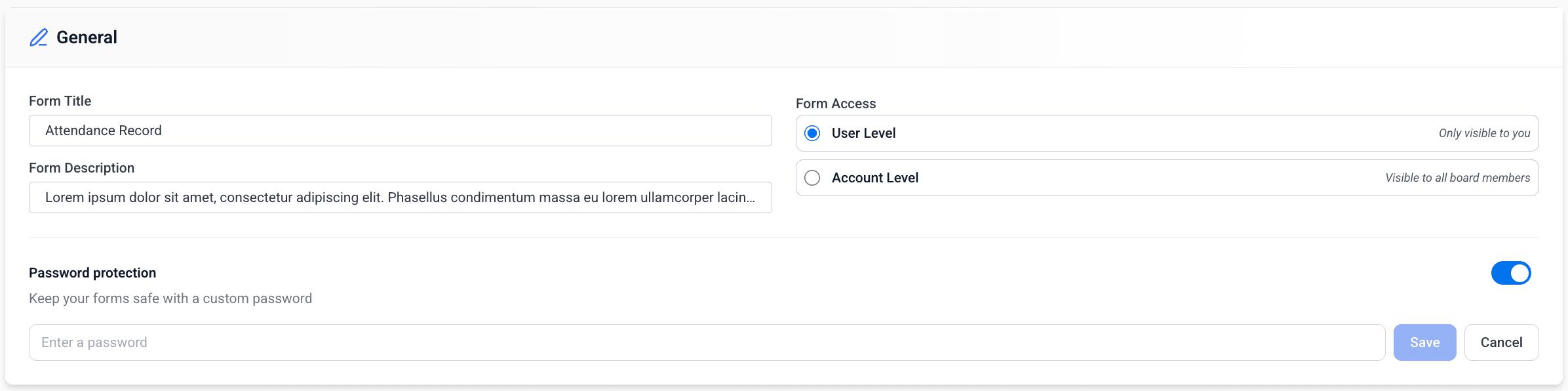
Title & Description
| Field | Description |
|---|---|
| Form Title | Internal name used to identify the form in the SmartForm view |
| Form Description | Optional internal notes — not shown to form respondents |
Form Access
Controls who can view and edit this form’s configuration inside SmartForm.
| Level | Description |
|---|---|
| User Level (default) | Only the form creator can view and edit this form |
| Account Level | All board members can view and edit this form |
Before deactivating a user who created forms set to User Level, switch those forms to Account Level first. Otherwise the form becomes permanently inaccessible to everyone.
Password Protection
Secure your form with a password so only recipients who know it can open and submit it.
Enable the Toggle
Turn on Password protection in the General section.
Set a Password
A password input appears. Enter the desired password and click Save. The password is displayed in plain text in the editor so you can copy it.
Share the Password
Copy the password using the copy icon and share it with your intended recipients manually (e.g., via email or message).
Change or Remove
Click Change to update the password at any time. Toggle off the switch to remove password protection entirely.
When password protection is enabled, respondents who open the form link will see a password entry screen before accessing the form content.
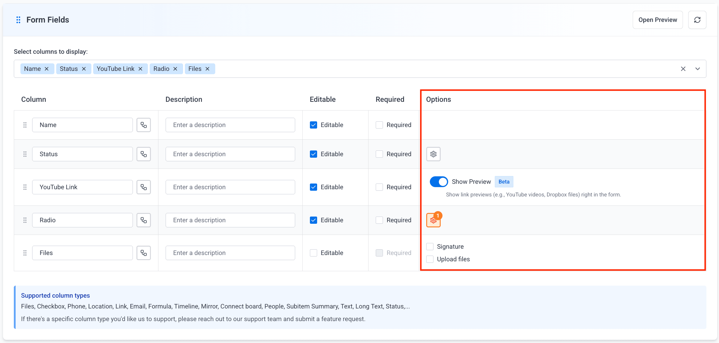
Form Fields Settings
Configure which board columns appear in the form and how respondents interact with each one.
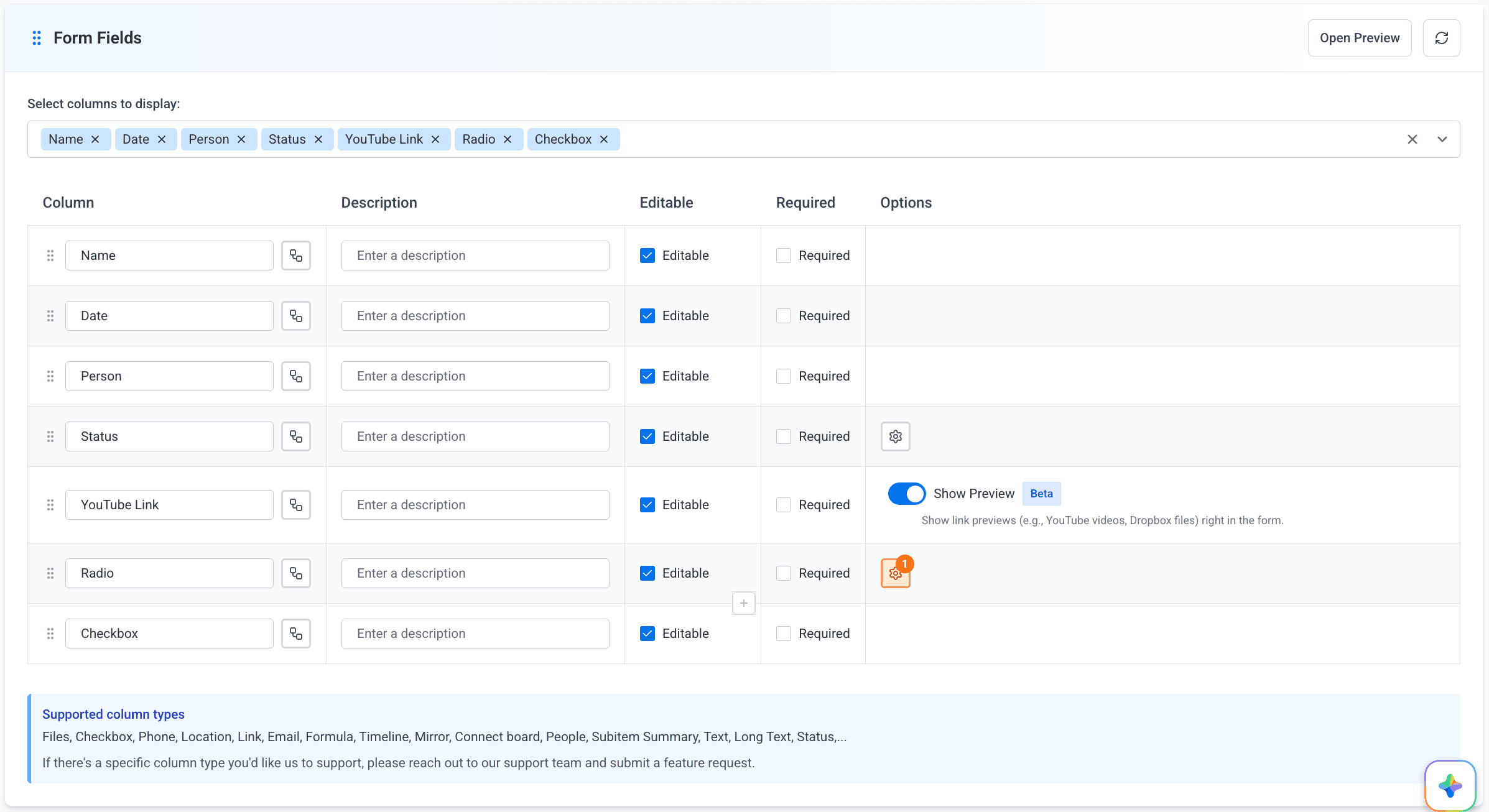
Selecting Columns to Display
Use the “Select columns to display” multi-select dropdown at the top of the Form Fields section to choose which board columns appear in the form. Only selected columns are shown to respondents.
Click Refresh (↻) at any time to sync the latest column changes from your Monday.com board into the form editor.
Field Configuration Table
Once columns are selected, they appear in a table. Each row corresponds to one form field and offers the following settings:
| Setting | Description |
|---|---|
| Column (Display Name) | The label shown to respondents. Edit the text directly in the field — the original Monday.com column name is preserved and shown on hover |
| Description | Helper text displayed below the field on the form. Click to expand into a larger textarea for longer instructions |
| Editable | Allow respondents to fill in or change this field. If unchecked, the field is shown as read-only |
| Required | Force respondents to complete this field before submitting. Only available when Editable is on |
| Options | Column-type-specific controls (see below) |
The Required checkbox is automatically disabled when Editable is unchecked, since read-only fields cannot be filled in by the respondent.
Column-Specific Options
Depending on the column type, additional controls appear in the Options column:
File Columns
| Option | Description |
|---|---|
| Signature | Replaces the field with a digital signature pad. Respondents draw their signature and it is saved to the file column on submission |
| Upload Files | Lets respondents attach one or more files during submission |
When Upload Files is enabled, choose one of three upload modes:
| Mode | Behavior |
|---|---|
| Upload only | Respondents can upload new files, but existing files are not shown |
| Display only | Existing files are shown for reference; respondents cannot upload new files |
| Upload & display | Both uploading new files and viewing existing ones are enabled |
A file column cannot simultaneously be used for signatures and file uploads. Create two separate file columns if you need both capabilities.
Link Columns
Toggle Show Preview to display an inline preview of the linked content (e.g., YouTube videos, Dropbox files) directly inside the form.
Link preview is currently in Beta. Contact support if you encounter any issues.
Status & Dropdown Columns
Click the Display Settings (⚙) icon to open the options manager, where you can:
- Hide specific options so they don’t appear as choices in the form
- Change the display format between Dropdown and Button Group for Status columns
A badge showing the number of hidden options appears on the ⚙ icon when any options are hidden.
Mirror, Formula & Board Relation Columns
These column types are display-only in the form. They show live data from connected boards but do not have Editable or Required controls.
Reordering Fields
Drag any row using the grip handle (⠿) at the left edge to reorder fields. Fields with conditional logic dependencies cannot be moved above the fields they depend on.
Inserting Sections, Videos & Images
Hover over any field row to reveal a ”+” button at the bottom center of the row. Click it to open a menu and insert one of the following below that field:

| Insert Type | Description |
|---|---|
| Add Section | Creates a visual section header with an optional title and description text to group fields |
| Add Video | Inserts an embedded video by URL (e.g., YouTube, Vimeo) |
| Add Image | Uploads and inserts an inline image |
Sections, videos, and images can be reordered with drag-and-drop, just like regular fields. Delete any of them using the × button on the row.
Conditional Logic
Each field has a Conditional Logic button in the Column cell. Click it to define rules that control when this field is shown to the respondent.
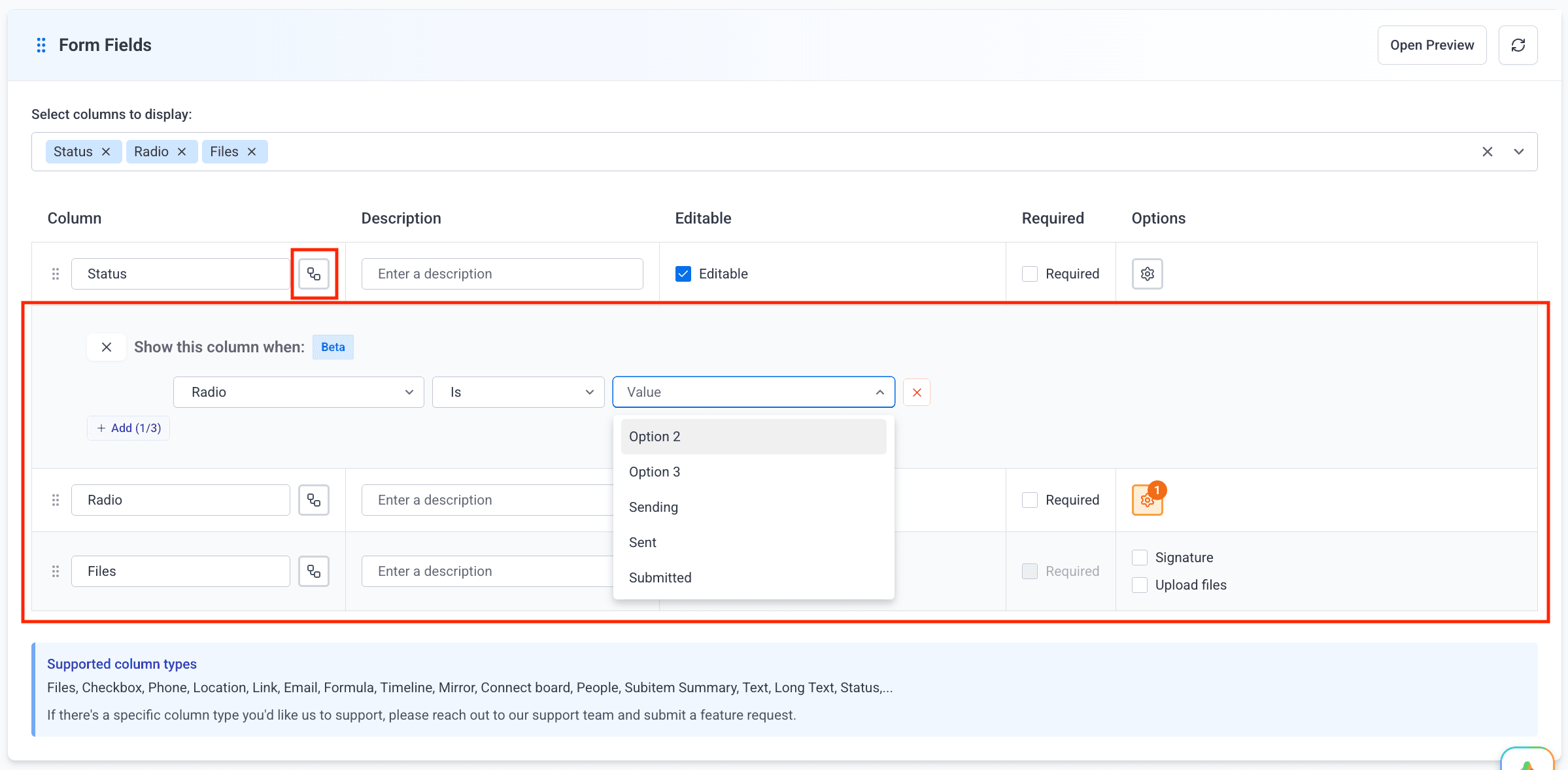
Open Conditional Logic
Click the icon on the field row. The configuration panel expands below the row.
Add a Condition
Each condition has three parts:
- Field — the other form field whose value is evaluated
- Operator — the comparison rule (e.g., “Is”, “Contains”, “Greater than”)
- Value — what the field should equal for the condition to pass
Set AND / OR Logic
When two or more conditions are added, choose AND (all conditions must be true) or OR (any condition must be true) using the logic operator dropdown on the second condition row.
Save
Conditions are saved automatically when you close the panel. The workflow icon turns orange and shows a badge with the active condition count.
Conditional logic is currently in Beta. Up to 3 conditions per field are supported. A field with conditional logic cannot be positioned above the fields it depends on — the editor will prevent the move or auto-reposition the field.
Supported field types for conditions:
| Column Type | Supported Operators |
|---|---|
| Status, Dropdown | Is, Is not, Is empty, Is not empty |
| Date | Is, Is not, Before, After, Is empty, Is not empty |
| Numbers | Equals, Not equals, Greater than, Less than, Is empty, Is not empty |
| Checkbox | Is checked, Is not checked |
| Text, Long Text, Phone, Email, Link | Equals, Contains, Does not contain, Starts with, Is empty, Is not empty |
Form Preview
Click Open Preview in the Form Fields header to open a live preview panel on the right side of the screen. The preview updates as you make changes to the form fields. Click Close Preview to dismiss it.
Subitem Fields Settings
Display or collect subitem data as part of your Item Form. This section is only available on Item Forms (not Subitem Forms).
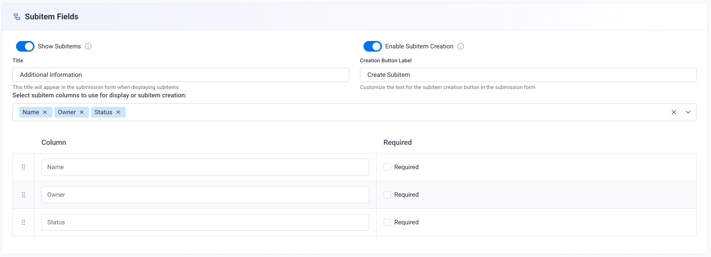
Show Subitems
Toggle Show Subitems to display the board item’s existing subitems to the respondent when they open the form.
When enabled, a Title field appears where you can customize the heading shown above the subitem list (e.g., “Additional Information”, “Current Tasks”).
If no subitem columns are found on the board, a message is shown. Add subitem columns to the board first, then return to configure this section.
Enable Subitem Creation
Toggle Enable Subitem Creation to let respondents create new subitems directly within the form before submitting.
When enabled, a Creation Button Label field appears where you can customize the text on the create button (e.g., “Add Task”, “Create Subitem”).
Both toggles can be enabled at the same time. This lets respondents view existing subitems and create new ones in the same form session.
Submission Settings
Control what happens during and after form submission.
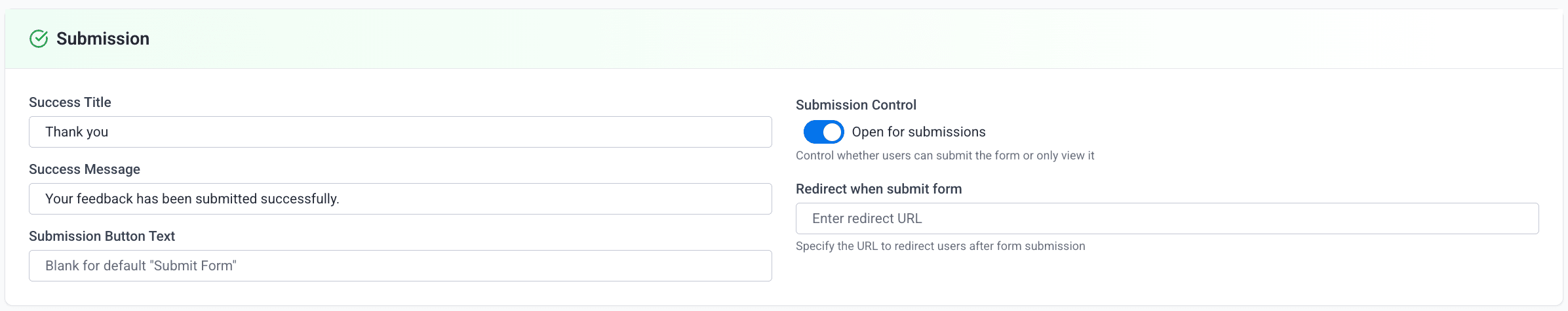
Success Message
Customize what respondents see after successfully submitting the form.
| Field | Description |
|---|---|
| Success Title | The heading shown on the confirmation screen (default: “Thank you!”) |
| Success Message | The body text shown below the heading (default: “Your response has been recorded.”) |
Submission Button Text
Change the label on the submit button from the default “Submit Form” to something more contextual.
| Use Case | Suggested Label |
|---|---|
| Job applications | ”Apply Now” |
| Event registration | ”Register” |
| Support tickets | ”Send Request” |
| Surveys | ”Submit Responses” |
| Orders | ”Place Order” |
Submission Control
Toggle Open for submissions to control whether respondents can submit the form.
| State | Behavior |
|---|---|
| On | Respondents can fill in fields and submit |
| Off | Form is visible but the submit button is disabled — read-only mode |
Redirect After Submission
Enter a URL in the “Redirect when submit form” field to automatically redirect respondents to another page (e.g., a thank-you page, a website, or a calendar booking link) after they submit the form.
Leave the redirect URL blank to show the default success message screen instead of redirecting.
Styles
Customize the visual appearance of your form.
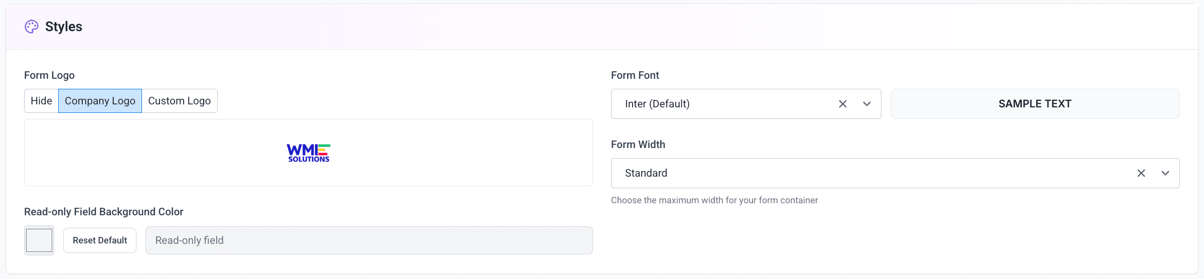
Form Logo
Choose how the logo is displayed at the top of your form.
| Option | Description |
|---|---|
| Hide | No logo is shown — minimal, distraction-free appearance |
| Company Logo | Uses your organization’s default Monday.com workspace logo |
| Custom Logo | Upload a form-specific image (JPEG, PNG, GIF, WebP, SVG — max 5 MB) |
When Custom Logo is selected, an upload button appears. Click it to select a file from your computer. The current logo is previewed in the editor once uploaded.
Read-only Field Background Color
Choose the background color applied to non-editable (read-only) form fields. Use the color picker to select a custom color, or click Reset Default to restore the default light gray (#f3f4f6).
A live preview of the chosen color is shown next to the picker.
Form Font
Select the typeface used throughout the form. Choose from the available font options:
| Font | Style |
|---|---|
| Inter (Default) | Clean, modern sans-serif |
| Roboto | Google’s neutral, versatile font |
| Open Sans | Humanist, highly readable |
| Lato | Elegant and warm |
| Montserrat | Geometric, strong headings |
| Nunito | Rounded, friendly |
| Poppins | Geometric with a modern feel |
A live SAMPLE TEXT preview updates next to the dropdown as you change the font.
Form Width
Choose the maximum width of the form container shown to respondents.
| Option | Description |
|---|---|
| Standard | Default width — suitable for most forms |
| Wide | Wider layout — useful for forms with many columns side-by-side |
| Extra Wide | Maximum width — best for data-dense or complex forms |
Advanced Settings
Configure automation-style triggers that fire automatically when form conditions are met.
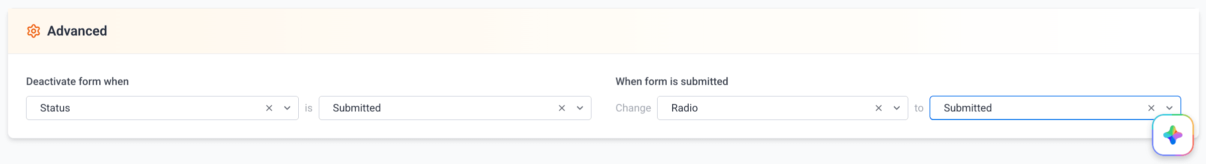
Deactivate Form When
Automatically disable form submissions when a specific status column reaches a specific value.
Choose a Status Column
Select the status column to monitor from the “Choose column” dropdown. Only Status-type columns are listed.
Choose the Trigger Value
Select the status label that will trigger deactivation from the second dropdown.
Example: Select “Application Status” → “Closed” to prevent new submissions after the application period ends.
When the deactivation condition is met, the form link becomes inactive and respondents see an error message indicating the form is no longer accepting submissions.
When Form Is Submitted — Change Status
Automatically update a status column to a specific value every time the form is submitted.
Choose a Status Column
Select the column to update from the “Change → Choose column” dropdown.
Choose the New Value
Select the status value to set from the second dropdown.
Example: Select “Lead Status” → “New Submission” to automatically flag every new form submission for follow-up.
Combine this with Monday.com automations (e.g., notify a team member, create a task) to build end-to-end workflows triggered by form submissions.
Contact Support
Need help with Item & Subitem Forms or other SmartForm features?
Need Assistance?
Our dedicated support team is ready to help you get the most out of SmartForm. Whether you have questions about setup, configuration, or advanced features, we’re here to assist.
Contact Support Team →